Tuesday, November 8, 2016

THESE REWORKED TRUMP-PENCE LOGOS ARE EQUALLY SHARP AND HILARIOUS

THESE REWORKED TRUMP-PENCE LOGOS ARE EQUALLY SHARP AND HILARIOUS

Last night, the Republican National Convention wrapped with the 75-minute speech of presidential candidate Donald Trump. It’s been quite the week in Cleveland and quite the range of speakers, from the Hunger Games-inspired antics of Stephen Colbert to Ted Cruz’s endorsement refusal to Scott Baio. But while those names have garnered attention lately, the name most tied to Trump is his running mate, Indiana Governor Mike Pence.
Yet, there’s a specific reason why the tag-team has been discussed more than usual—their logo.
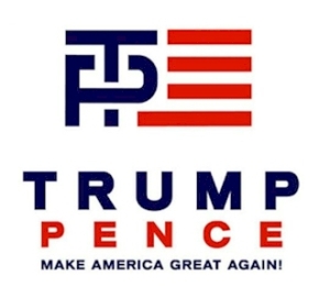
Trump-Pence Logos, by LogoMyWay Designers
It’s not a great logo. While also not a terrible logo, the T inside the P has been the most head-scratching design element. There’s certainly a logic there, but it could’ve done better. That’s why the design community at LogoMyWay decided, hey, maybe we can do better.
To clarify, LogoMyWay is a crowdsourcing site for logo designs and it has 20,000+ designers from all over the world. So these are legit designs from professionals, but it’s still a logo for the Trump campaign, which itself has been absurd. So hundreds of revamped logos poured in; some hilarious, some better than the current one.
DON'T FORGET TO GO TO: www.sacredimprint.com

Good Luck Finding Your Way Out of This Challenging Maze Print

Good Luck Finding Your Way Out of This Challenging Maze Print


A love of mazes never goes away. It’s an easily understood concept that always has the potential to stump you. As a child, you adore them as a test of will and determination, whether on a kids menu or a legitimate one at a local fair. As an adult, it keeps your mind spry and allows you the chance to relive the spirited and youthful challenge of escape. But rarely do mazes come as slick as the Stellavie’s maze print.
Stellavie is a non-nonsense, independent, and creatively led, multidisciplinary design studio and manufacturer from Hamburg Germany. The studio specializes in paper prints because their team appreciates numbering and signing edition prints. Stellavie’s Steffen and Viktoria worked “crazy hours” on their latest long-time passion project, a labyrinth beauty.
“We have worked crazy hours lately on yet another long-time passion project and developed a truly challenging maze print. No algorithms used, everything drawn by hand, digitized and silkscreen printed.”
The braided maze print is inspired by the work of “the most fascinating maze enthusiasts of the last century. Purposefully “incredibly hard to solve,” with multiple loops forcing the escapee to doubt their history of moves, the maze allows to ways to be solved.

DON'T FORGET TO GO TO: www.sacredimprint.com

Monday, November 7, 2016

Swiss Style Now

Swiss Style Now


Swiss Style Now Aug 18, 2016 5:36 pm13 Email Pinterest Twitter Facebook The Swiss Style Now, an exhibition presenting an overview of Swiss graphic design from the last five years, will open on September 6 at the 41 Cooper Gallery. The exhibition will feature a wide range of approaches, techniques and media utilized by contemporary designers. The Swiss style of graphic design is perhaps the most influential movement of the 20th century, known for its minimal grid-based systems. It's a style and design philosophy that still influences today's Swiss designers, but their work might be deemed more diverse, emotional and fun. Work by a hundred currently working Swiss designers, including Ludovic Balland, Stephan Bundi, Büro Destruct, Melchior Imboden, NORM, Felix Pfäffli, Tania Prill, Ralph Schraivogel, Niklaus Troxler, Martin Woodtli, Jonas Vögeli and more, will be on view. 


DON'T FORGET TO GO TO: www.sacredimprint.com

Ragged Edge Creates Disruptive Brand for Foley's

Ragged Edge Creates Disruptive Brand for Foley's 

Ragged Edge created a disruptive brand for Foley's, a new restaurant in Fitzrovia, London. The design includes four different hand drawn typefaces to reflect the restaurant's diverse offer. Foley's is a newly launched restaurant in Fitzrovia, which was set up following a successful six-week trial as a pop up in Shepherd's Bush. The restaurant opened in Foley Street this summer and serves an eclectic range of high-end dishes in a laid back environment. The team behind Foley's challenged Ragged Edge to create a brand that reflected their aim to do fine dining differently. A series of workshops defined a bold vision for Foley's: high-end food with an anything goes approach. The restaurant ignores traditional constraints around specific cuisines and styles. Instead, they set out to bring a diverse range of ingredients, recipes and influences together in new and exciting ways. Ragged Edge delivered brand strategy, visual identity, interiors consultation and printed collateral. A total of four hand drawn, bespoke typefaces were created. Each typeface has its own distinct character which combine to form an unexpectedly harmonious whole, illustrating the restaurant's eclectic approach. The typefaces included a sans serif, slab serif, script and stencil weight. The typefaces are supported by a paired back design system that features a neutral colour palette, complemented by bright blue and orange highlights. Menus, uniforms and collateral are refined and elegant, yet playful and relaxed, just like the food. "The restaurant's anything goes approach led us to a brand idea that was rich in creative possibilities: bringing good things together," commented Max Ottignon, Co-founder, Ragged Edge. "This was expressed by the four hand drawn typefaces that could be combined in a range of different ways to create an eclectic yet harmonious result. The logo, which features letters set in each of the typefaces, is the perfect expression of Foley's disruptive approach. "The simple, paired back nature of the rest of the identity system came from a desire to remove any barriers between the customer and the food." 

DON'T FORGET TO GO TO:www.sacredimprint.com


MovieMerge+ brings back intuitive video editing no longer available in iMovie


Since Apple ruined iMovie, it's been really difficult to snap out good, high quality editing. Once upon a time you could assemble a series of video takes into a superb video in just minutes. Now, thank goodness for MovieMerge+! MovieMerge+ helps professional and amateur video content creators who need a simple, easy-to-use tool for organizing and joining a collection of video clips together into a single movie -- exactly like iMovie was originally intended. This update includes expanded undo support, timeline presets, swipe-to-delete and a variety of other minor user interface enhancements.
Douglas A. Welton, Chief Product Officer at einstein's legacy says
Quoting  begins For the 2.7.1 release, we continued to refine the user experience in ways that help our customers work more effectively. We have added poster images to the movie table along with swipe-to-delete functionality. We integrated presets into the timeline. And, we enhanced our Undo support to make it easier to "get things right" when working with movies -- With these changes, MovieMerge+ is the perfect tool for content creators in education, advertising, digital signage, video production, and stage performance. Quoting  ends
MovieMerge+ 2.7.1 includes the following key features:
  • Easy Organization Drag'n'drop to position the segments in your desired order for the final movie output.
  • Automatic Chapters Create a chapter track with visual markers located at the beginning of each segment.
  • Track Thinning Limit the output movie to include only the video and audio tracks from each segment source.
  • Precise Navigation Double-click the scrub handles (the in-point and out-point) to set a movie segment with frame-level accuracy.
  • Modern Codecs Create new movies in a variety of formats for a range of devices and playback situations.
  • Background Exports New movies are created in the background, enabling you to continue working without waiting.
  • Simple Segmentation Include all or part of a movie in the output by adjusting the in-point and out-point handles.
  • Sharing Share your output directly to Vimeo, Facebook, Twitter and other popular internet service
DON'T FORGET TO GO TO: www.sacredimprint.com

HOW Design Live’s Purpose Is To Make A Difference

The team at HOW Design Live spends quite a bit of time thinking about the role we play in the design profession and how we can make a difference in your careers — and lives.
We have a responsibility to ensure that the time and money you invest attending the conference delivers an experience that will have a positive and affirming impact on your work, your career and the choices you make in your life. What’s important to you is important to us.
What guides us is a sense of purpose and we’ve tried to capture what we believe that purpose is. So here it goes …
HOW Design Live’s purpose is to remind you of why you became a designer in the first place and to remind you that what you do makes a difference and has the capacity to change the world. 
HOW Design Live’s purpose is to help you identify what has meaning in your work and how you can shape your career, or life, to ensure that what you do is meaningful in whatever way is meaningful to you.
HOW Design Live’s purpose is to bring together like minded people who share the same sensibility about creativity and to help foster relationships and friendships that can last a lifetime.
HOW Design Live exists to serve you and your best interests because we believe every one of you can make a difference. That is the source of the passion, energy and sense of purpose we bring to work every day.
The power of design is driving change in our world and HOW Design Live is a catalyst to harness and release that power and in 2017 we’ve recruited what we believe is the strongest speaker roster we’ve ever assembled.
And our reputation for providing the most eclectic, iconic and powerful keynotes in the design industry continues in 2017 with speakers that include Malcolm Gladwell, DeeDee Gordon, David Carson, Pum Lefebure, Jeffrey Zeldman, Seymour Chwast, Jessica Hische, Amy Cuddy, Kelli Anderson, Natasha Jen, Timothy Goodman, Brian Collins and Mauro Porcini.
HOW Design Live 2017 will be a journey of discovery, inspiration and purpose that can’t be missed and one you will never forget. It’s where creatives converge to ignite their passion and create their futures. It’s where you need to be on May 2 – May 6 in Chicago. See you there.

DON'T FORGET TO GO TO: www.sacredimprint.com

What is a info graph in graphic design?