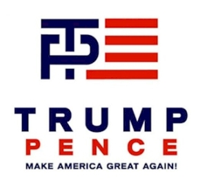
THESE REWORKED TRUMP-PENCE LOGOS ARE EQUALLY SHARP AND HILARIOUS
Last night, the Republican National Convention wrapped with the 75-minute speech of presidential candidate Donald Trump. It’s been quite the week in Cleveland and quite the range of speakers, from the Hunger Games-inspired antics of Stephen Colbert to Ted Cruz’s endorsement refusal to Scott Baio. But while those names have garnered attention lately, the name most tied to Trump is his running mate, Indiana Governor Mike Pence.
Yet, there’s a specific reason why the tag-team has been discussed more than usual—their logo.

It’s not a great logo. While also not a terrible logo, the T inside the P has been the most head-scratching design element. There’s certainly a logic there, but it could’ve done better. That’s why the design community at LogoMyWay decided, hey, maybe we can do better.
To clarify, LogoMyWay is a crowdsourcing site for logo designs and it has 20,000+ designers from all over the world. So these are legit designs from professionals, but it’s still a logo for the Trump campaign, which itself has been absurd. So hundreds of revamped logos poured in; some hilarious, some better than the current one.
DON'T FORGET TO GO TO: www.sacredimprint.com


No comments:
Post a Comment